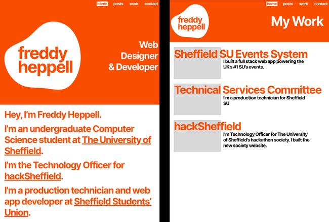
My website’s got a fresh coat of paint—and a big overhaul under the hood too.
Today I’m releasing the new design for my website, built with Jigsaw and Tailwind. I started working on this in January, it’s taken a while but I’m really happy with the results.
Prototyping
The process of redesigning my site started towards the end of January, with this prototype in Sketch.

This prototype was a garish, (intentionally) unaligned mess, but it did give me a couple of useful ideas—mainly the blob that now sits at the top-left of this page, and the idea of combining this very curvy shape with hard, square edges.
Round 1: Nuxt
I started building an inverted version of this site in Nuxt, which a few people I know had recently adopted, but a couple of things annoyed me enough to stop development: the fact I couldn’t pass data up the hierarchy in the way that frontmatter works in many static site generators, and the fact I’d have to totally roll my own Markdown processing. Ed has since switched his site to Gridsome for similar reasons.

Round 2: Jigsaw
Eventually I decided to make a traditional static site, but using Jigsaw this time, a static site framework for the Laravel ecosystem. It’s much more like Jekyll, what my old site used, than new JS-based frameworks. Jigsaw works on a slightly lower level than Jekyll which fixes a few of the complaints I have with it [1]. I started work on this off-and-on in mid-March.
Jigsaw supports Mix, Laravel’s webpack wrapper, out-of-the-box. I’ve previously tried to get Gulp working with Jekyll (so I could use uncss) but that was a real hassle and I didn’t get too far with it.
With this new site I’ve also finally ditched Bootstrap. Whilst I still believe it’s a great fit for web applications, I wanted to push the boundaries a bit for my site. This site uses Tailwind with little handwritten CSS and only a few configuration changes. In production, I run PurgeCSS, which brings down my CSS to about 10 kB.
Design
I ended up not really prototyping this version in Sketch, instead opting to do it in-browser with Tailwind. I’ve never really developed a large project with Tailwind before, and I really enjoyed the flexibility that came from just using CSS instead of writing it.
All the text is in Inter with a few font variants enabled (e.g. I, l, 0, a). When Inter Display is ready, I’ll be changing larger text (or at least the homepage) to it.
Deployment
Like my old site, I use Netlify to build and host my site. I’ve considered combining Cloudflare Workers Sites with GitHub Actions to make my own deployment pipeline, but for the moment I’m happy with Netlify.
The Future
I want to finally get this site out there, so I’m releasing it with a few TODOs. Firstly, a dark mode (because of course), and to improve webfont delivery. Inter is an amazing font, but due to its incredible character support it’s also very big. I’ll try to set up something similar to this great tutorial.
Much of this site was written late at night while juggling three web app development projects. If you spot any typos, bugs, or just want to say hi, feel free to contact me.
My old design is preserved forever on the Wayback Machine.
Thank you to Ed and Jen for all your feedback during development.
Primarily that posts are a special ‘magic’ collection that has features you can’t implement on your own collections, like categories and tags. ↩︎